


zhora is litening to:
we now have all the liveries for F1 this year. with new regulations and two new teams, the liveries this year have probably been my most anticipated liveries. i will rank them worst to best
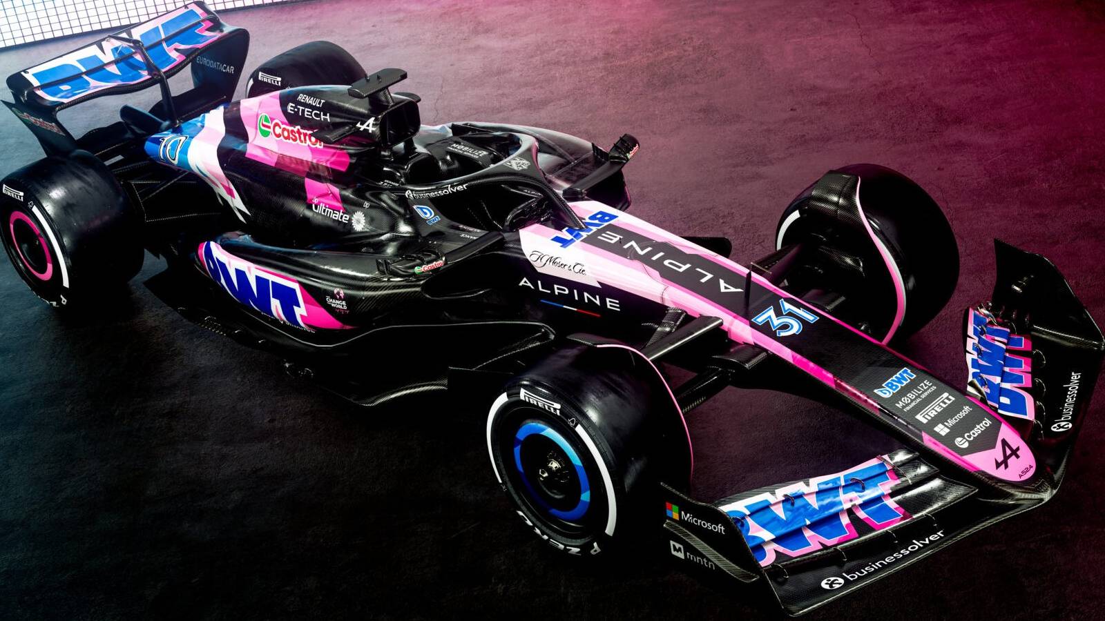
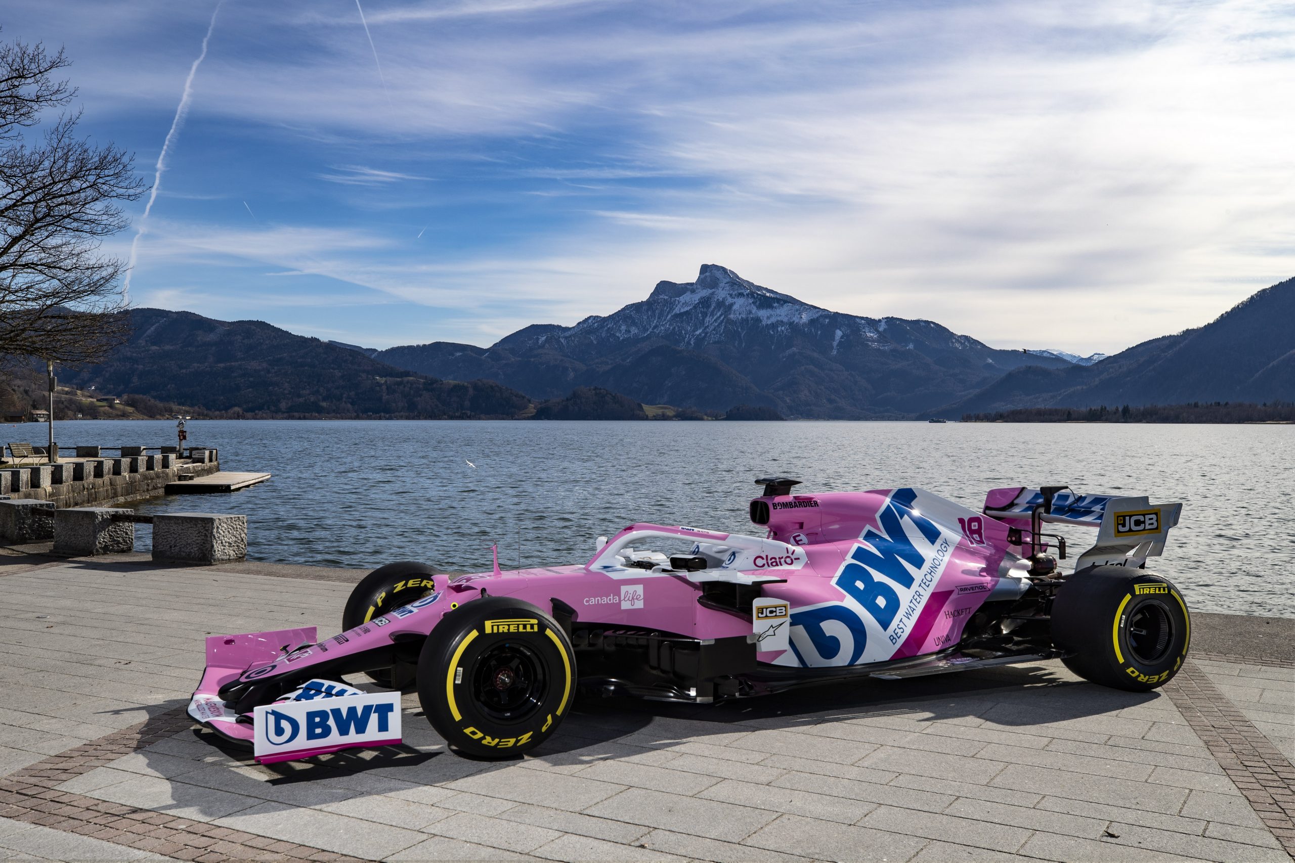
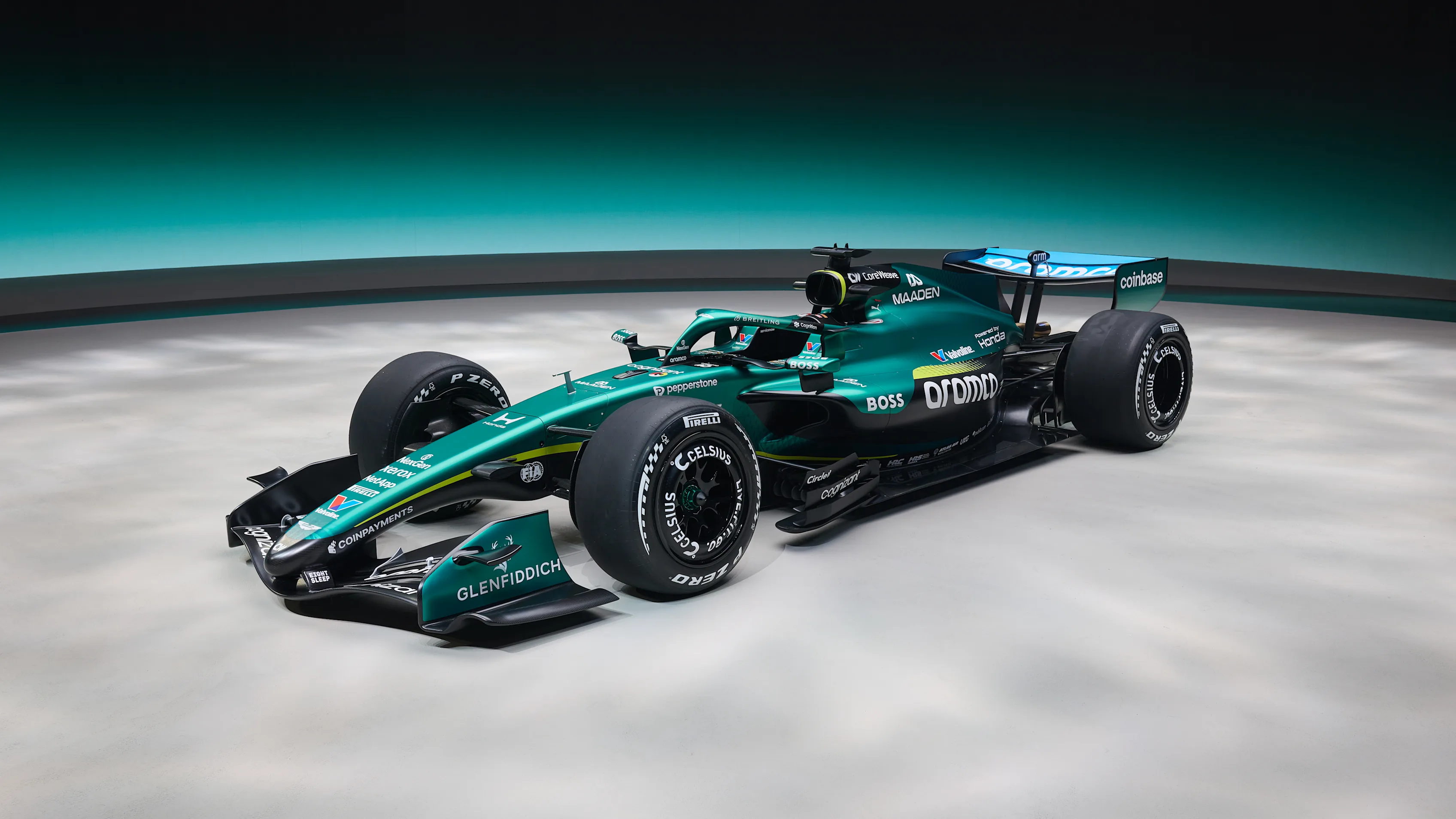
during the Racing Point era and the last few years of Sahara Force India, this team made some of my favourite liveries. the Tracing Point from 2020 is probably my second favourite livery in the history of the sport. the pink with that white sash gels so well with my eyes. unfortunately nothing since the name change has lifted itself off the bottom of my rankings (except for 2024 but that was due to Alpine fumbling and not Aston improving) I take issue with the descending lime green line and the black that creeps higher every year clashes so much with that dark green imo.
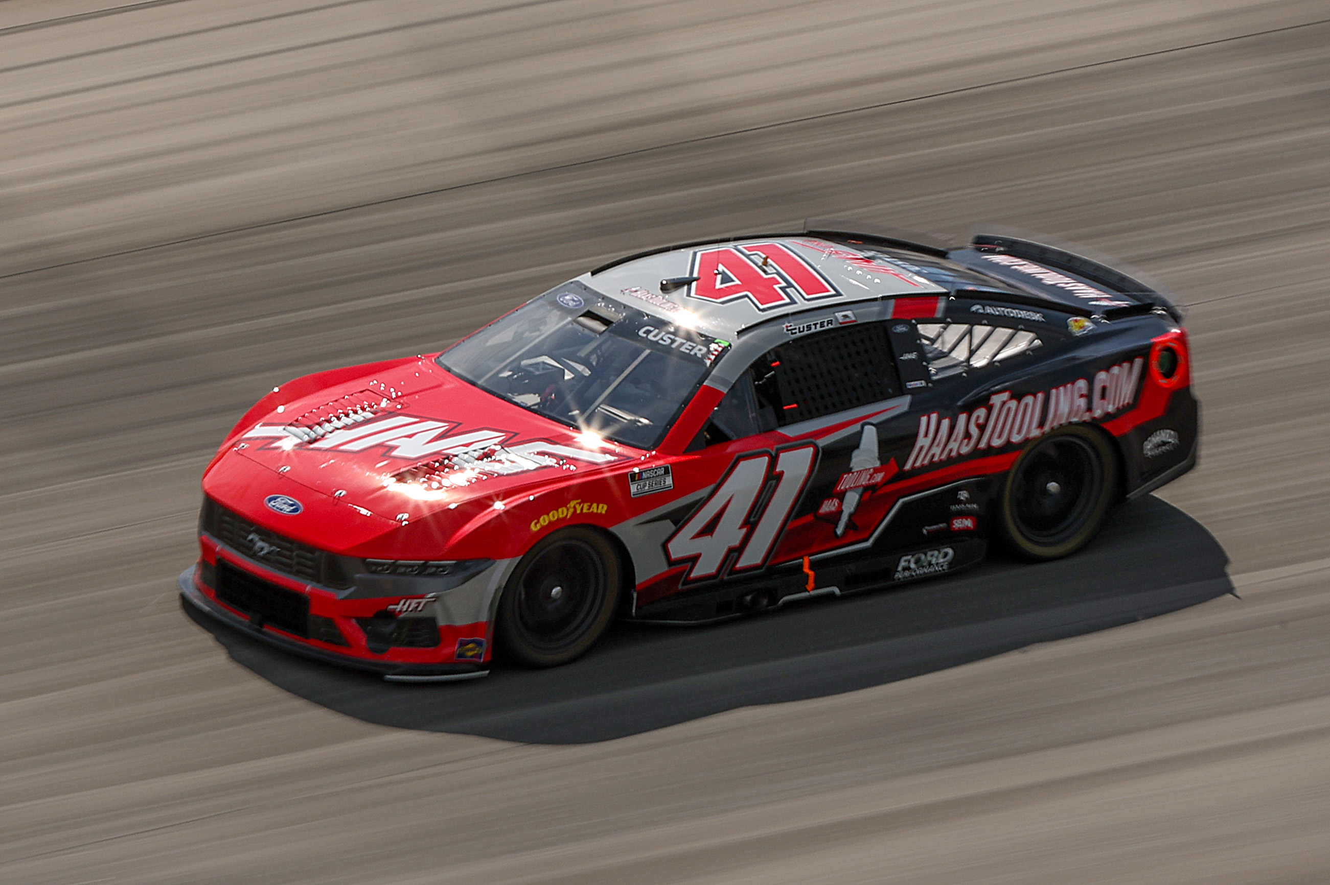
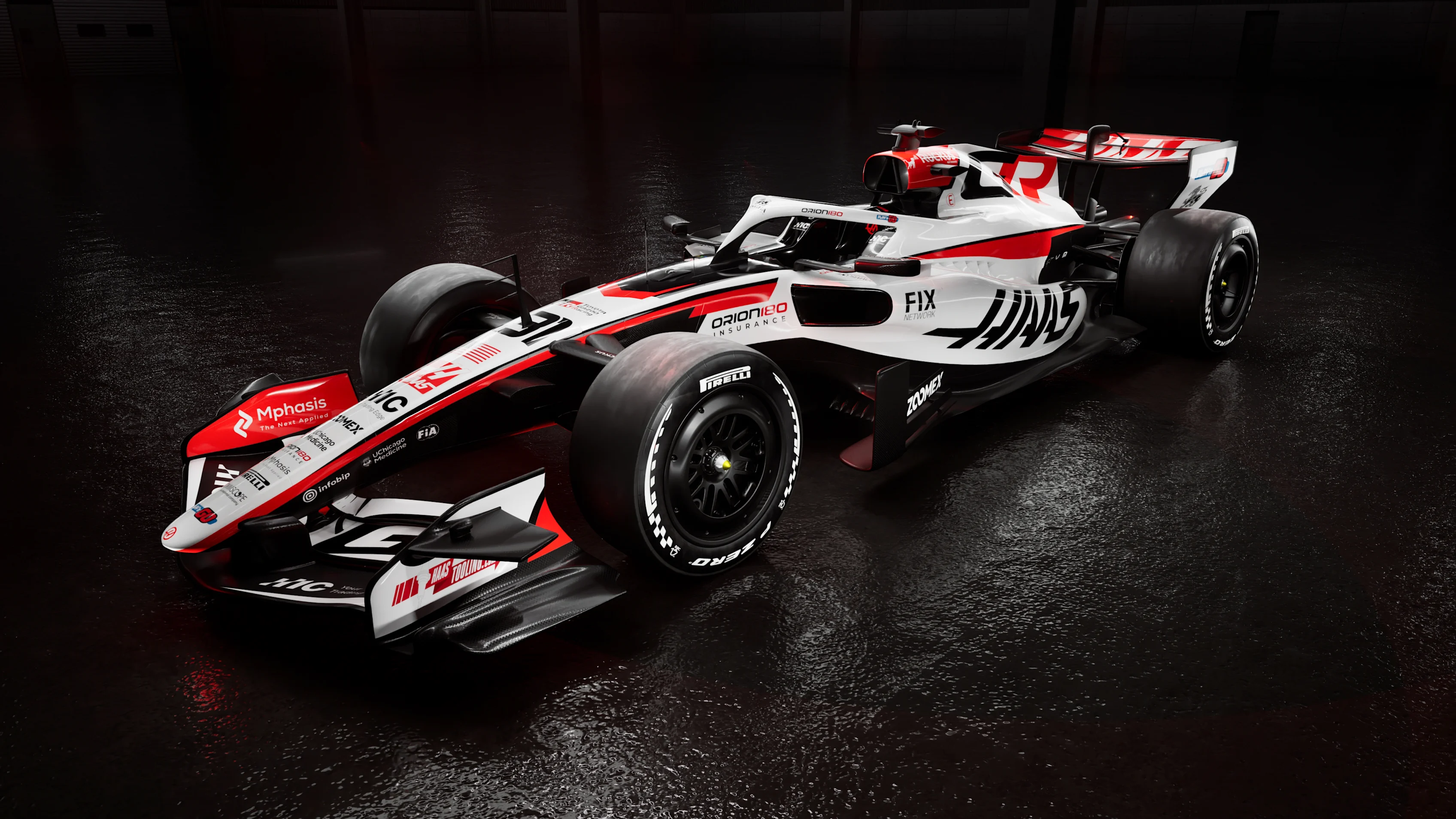
this one feels very uninspired to me. white and red are just very uninspiring colours in motorsports, plus they're Ferrari's colours. I would've much preferred if they swapped the white for grey like they do on their No.41 NASCAR team or even used that dark grey where they've painted black or red on the Haas logo, though I'd imagine their partnership with Toyota is why they're going for the white and red as they both share those colours, so we probably wont see the grey return for a while. the red stripe as it curves down the sidepod and the positioning of the Haas logo on the side pod are my main problems with this, hopefully that later detail will change if they introduce a new sidepod concept at some point in the season which would push Haas into 8th on this ranking.
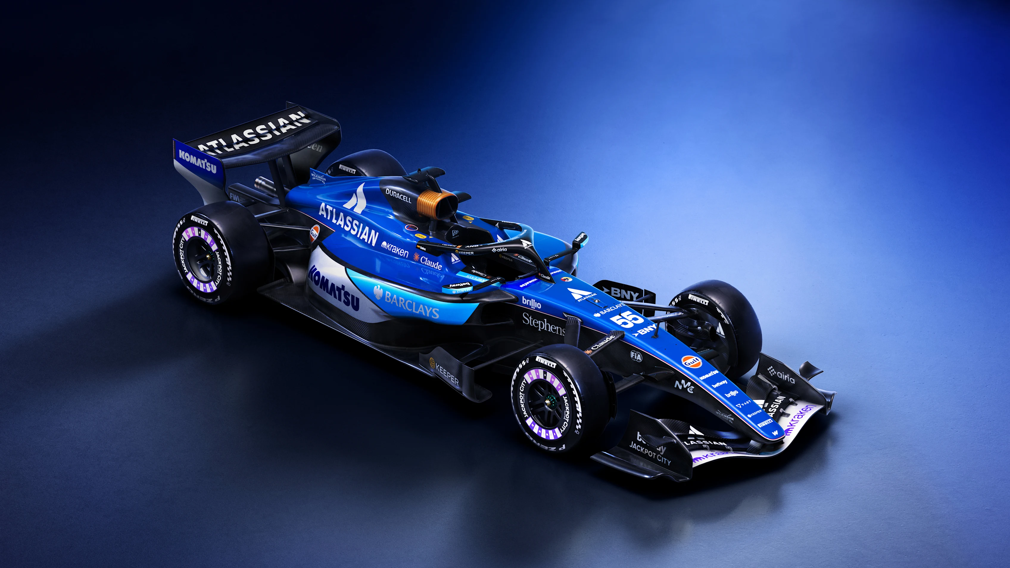
it feels as if Williams don't know who they want to be in 2026. the front wing and nosecone feel very smart with the dark blue and white stripes but from the halo back it feels like the metro design from Microsoft in the 2010s, then the black wing screams sporty and racey. what is it Williams? you can't be all three, not like this at least
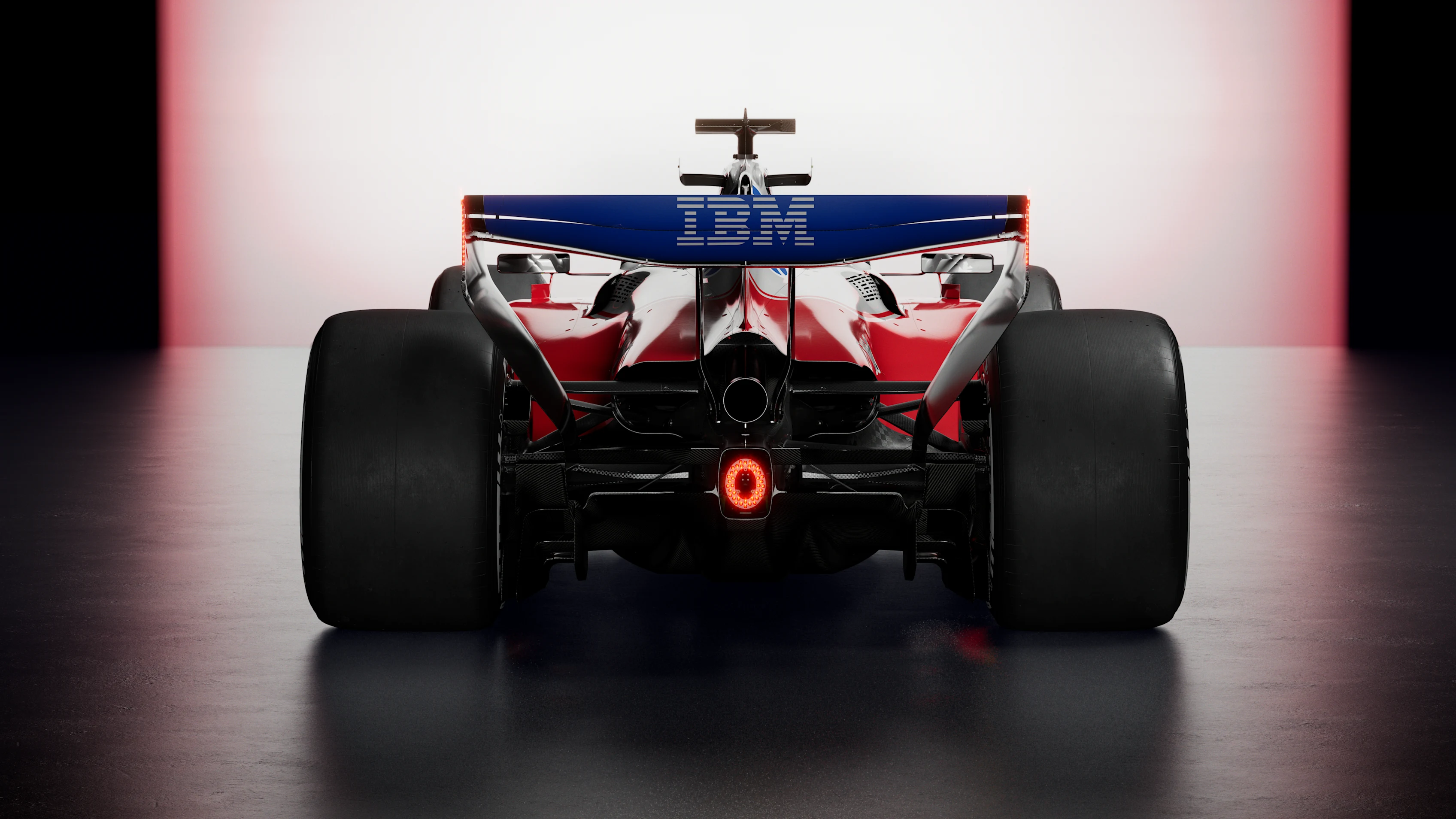
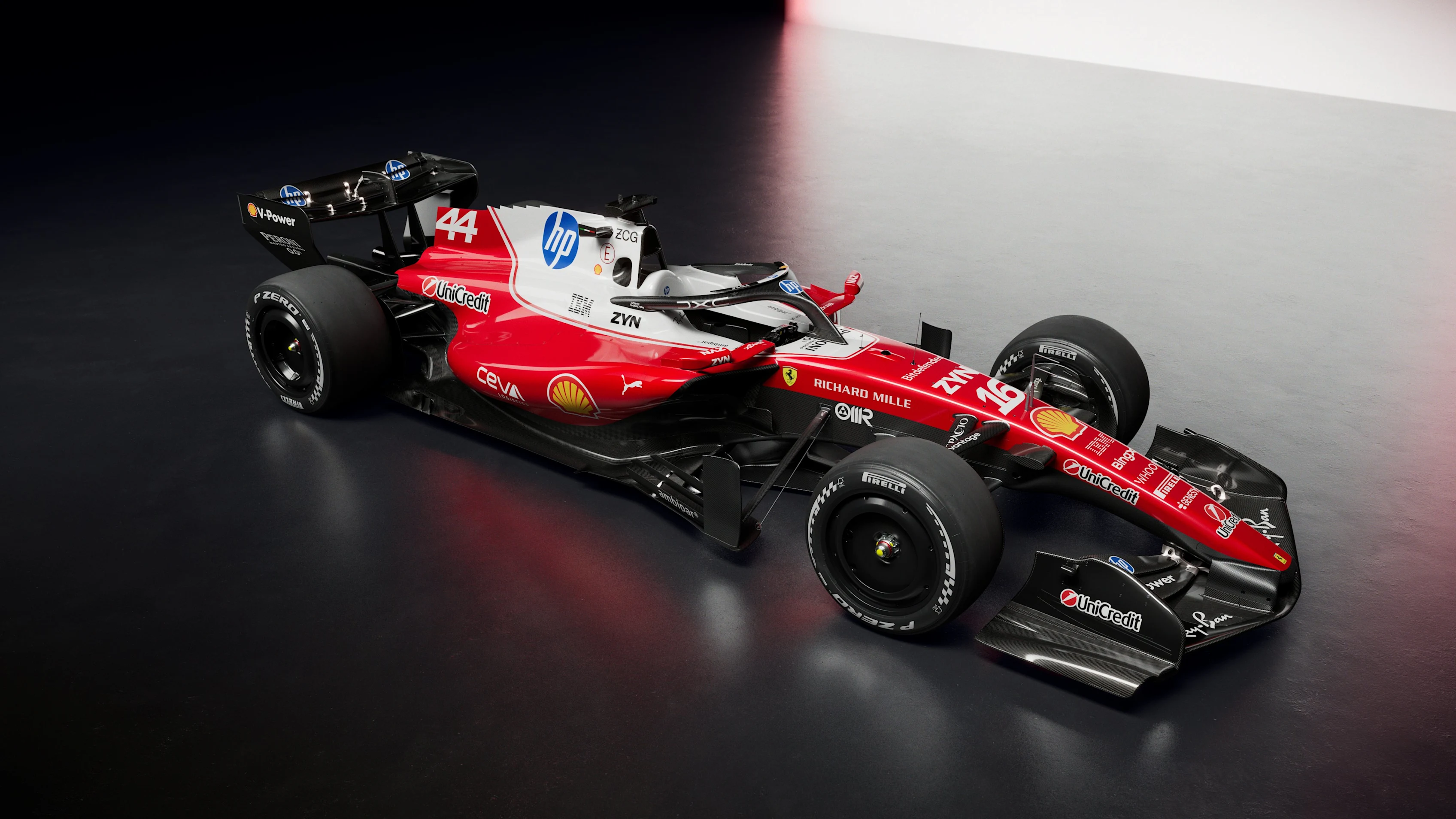
this is the first one I don't dislike. it's hard to hate Ferrari, even as a supporter of their rivals, it's even harder to hate their liveries. I mentioned in Haas' section that white and red are overused in motorsports, that's due to how iconic Ferrari's liveries and road cars are. They started the trend so they can and will get away with it. i do have to complain a little that this year doesn't hit as well as recent attempts from them though. that said the images we have of the rear of the car look menacing, I'd be hoping not to be behind them if I were a driver.
